myMTN App — Digital Services Redesign
Background
Every app has features it’s proud of and features it hides. The myMTN app’s digital services — music, video, gaming, and more — were the second kind. Not by intention, but by architecture.
Seven services lived inside the app: CallerTunez, MCare, 2CTV, MTN Shortz, PlayVOD, Streaming Unlimited, and Mdundo. Services users would genuinely enjoy, if they ever found them.
The
Problem
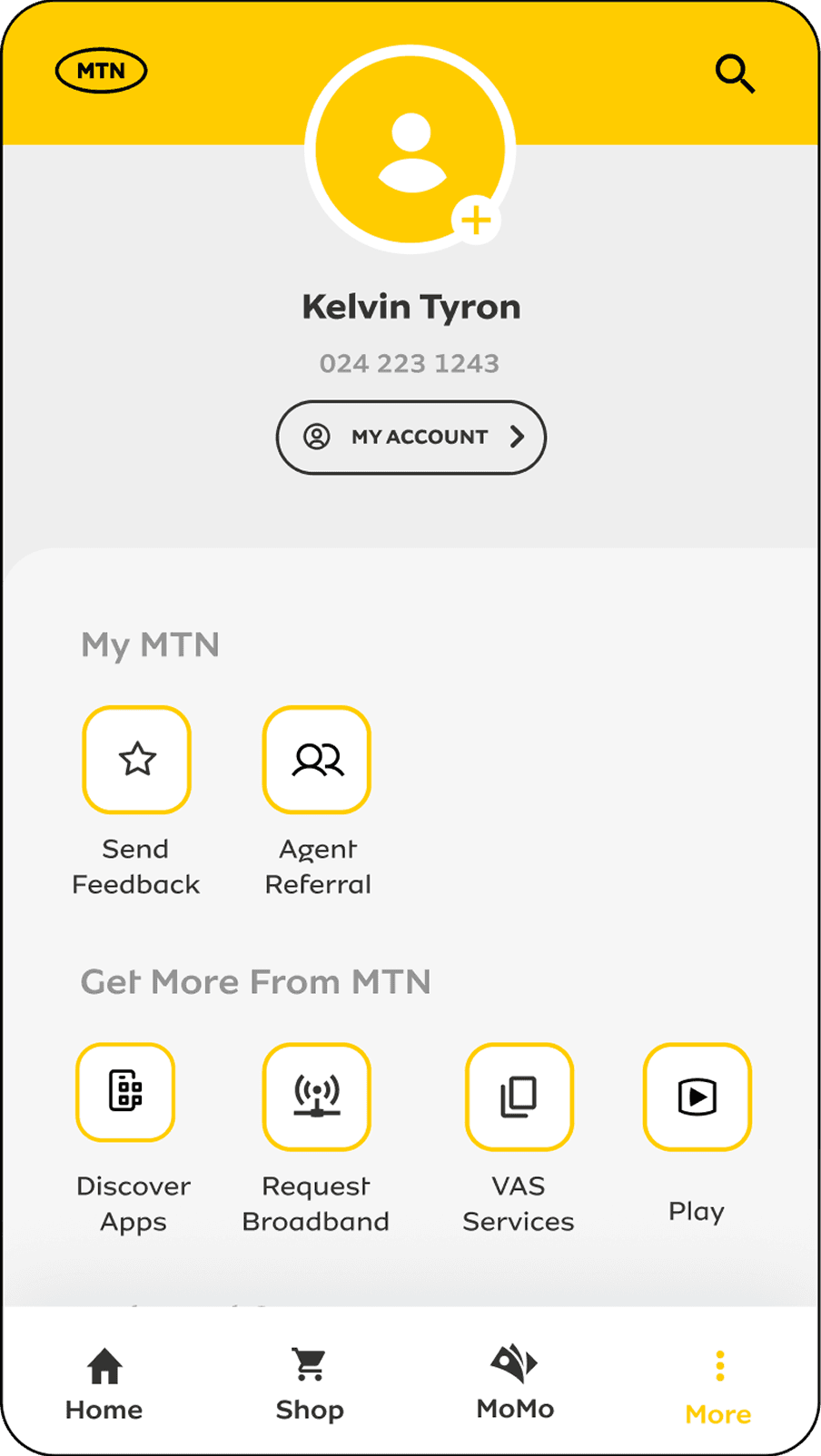
The digital services were buried on the More page, four steps away from the homepage. Four steps is a long way to travel for something you don’t know exists.
The main issues:
- Discoverability was near zero. A user had to already know the services existed, and know where to look, to ever reach them.
- The entry points themselves didn’t help. Each service was represented by a logo and a text label, nothing that communicated what the service actually was or why anyone should tap it.
Specific goals
Move the services from where the app wanted them to where users would actually find them — and make the entry points communicate, not just exist.
Focus metrics
Monthly active users per service, before vs. after
Solutions
Problem
Discoverability was near zero. A user had to already know the services existed, and know where to look, to ever reach them.
Solution
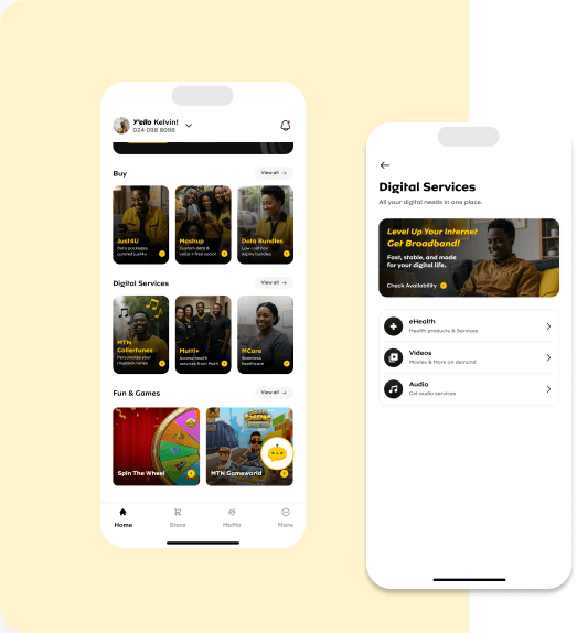
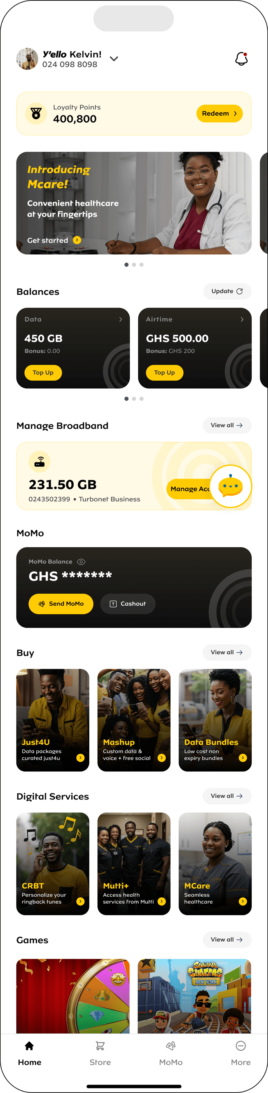
Relocated the services from the More page to the homepage. What previously took 4 steps to reach now takes 1. Placement communicates priority — if the app treats a feature as an afterthought, users will too.
Redesigned the information architecture of the services section. The services were restructured so a user scanning the homepage can understand what’s on offer at a glance, instead of decoding it from a buried list.
Before
After
Research &
Discovery
How we discovered the next problem
Online Usability Testing
After the relocation shipped, we ran usability tests with users on the redesigned section. We were listening for how they navigated, but what stood out was how they talked.
Users kept stumbling on the phrase “digital services.”
- They could see the section. They could tap it. But they couldn’t tell you what it meant.
- “Digital services” is our internal lexicon — a category name that makes sense in a roadmap document, not in a user’s mental model.
- When users described what was actually inside — music, movies, games — they reached for one word we weren’t using: entertainment.
It was a reminder that you can fix the architecture and still lose users at the label. The words are part of the interface.
The People I Worked With
I collaborated (and still am) with a number of stakeholders on this initiative:
UX/UI Designers - as the team lead, I managed and steered my team to bring the solutions to life.
Product Owners - we worked with them to prioritise the changes we wanted to make.
Developers - we designed, they developed.
Success through design.
140.9K Peak MAU
140.9K Peak monthly active users on health e-vertical (Apr 2026) — up from ~1,200/month before the redesign
+166% MAU
+166% video service monthly active users, before vs. full rollout (988 → 2,630 avg/month)
+233% to +265% Growth
Increase in total active monthly users due to improved user engagement
Solution – Phase 2
The next chapter is already in motion…
Phase 1 proved that placement and architecture change behaviour. Phase 2 is about language, richness, and breadth.
Renaming “Digital Services” to “Entertainment.” Straight from the usability tests: we’re retiring the internal lexicon and adopting the word users already use. A section name should describe the experience, not the org chart behind it.
Redesigning the entry cards from logo-and-text to content-forward. The current cards show a logo and a service name — they identify the service without selling it. The new cards lead with the content itself: album art for music services, game posters for gaming, movie posters for video. A card showing an actual film says more in half a second than a logo ever will. The services will stand out more and communicate more.
Introducing a new section: Lifestyle. Not everything in the catalogue is entertainment. Services like food delivery, travel, learning, and health don’t belong under music, video, and gaming — forcing them there recreates the same mental-model mismatch we just fixed. Lifestyle gives them a home of their own, with a label users will actually recognise.