myMTN App — Prompt Messages and Screens Redesign
Background
Prompt messages and screens, whether for success, error, pending or approval purposes, are essential components of user interface and experience design.
In apps, websites, and even USSD, they contribute to usability, trustworthiness, efficiency, engagement, and user learning.
The Problem
The MyMTN app’s error, success, and pending messages and screens did not meet the standard of that of a nationally acclaimed company. The main issues were:
- The messages were long, ambiguous and did not provide the user with any means of recovery, especially the error messages.
- The UI of the screens were cluttered and “noisy”.
- The CTA’s were not clear and did not encourage the desired action in the user. There was a missed opportunity to direct the users’ behaviour even after an action or purchase.
Specific goals
- Improve error recovery
Focus metrics
- Task Success Rate
The Updated Design - WIP
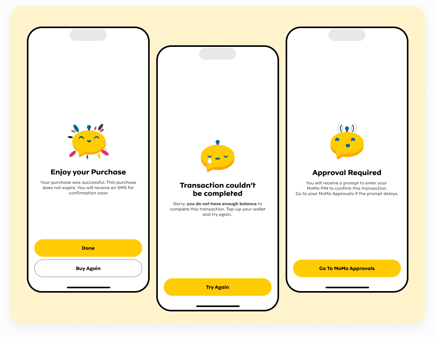
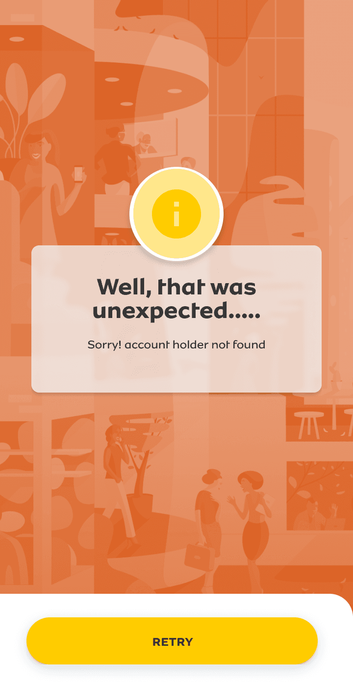
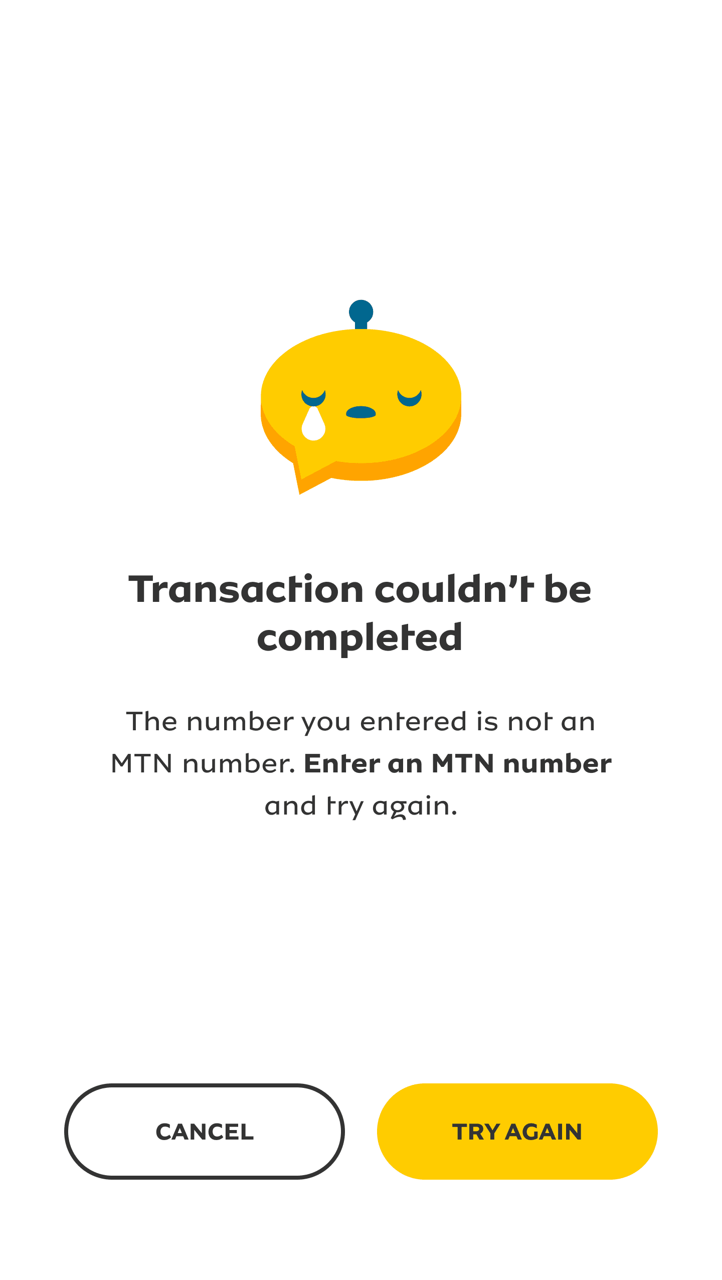
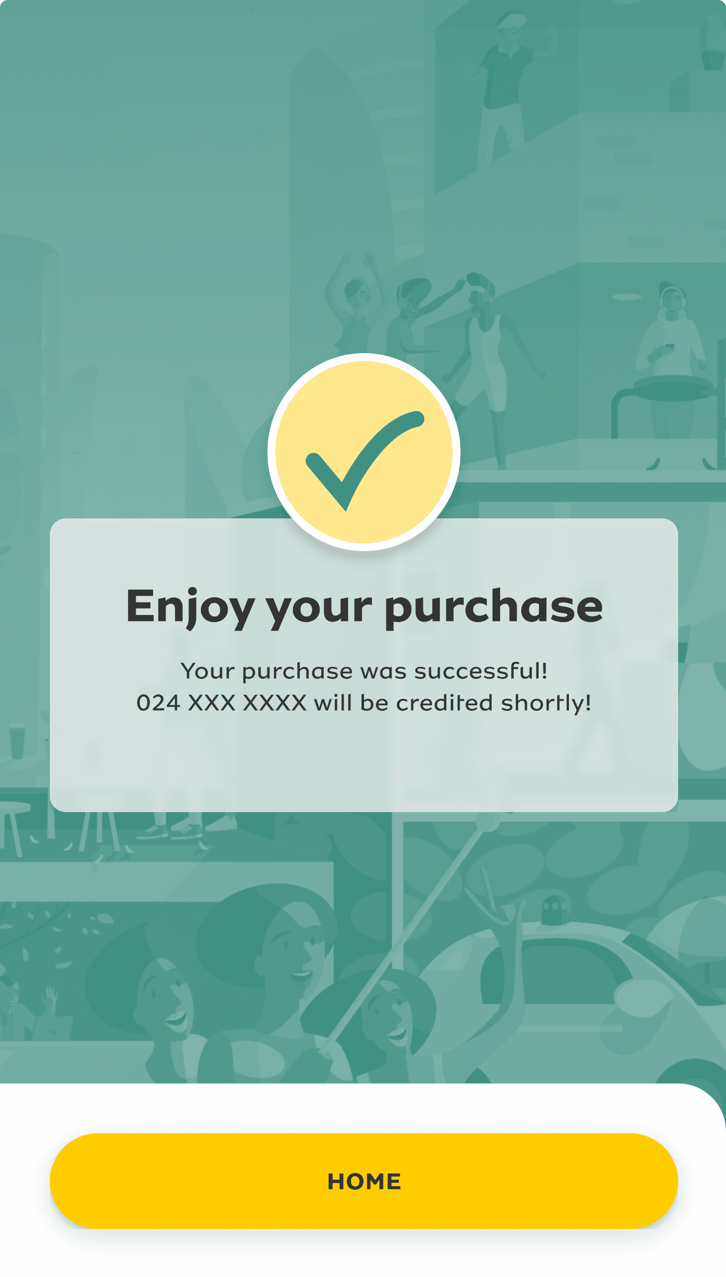
Revised Error and Success Pages
Error Page

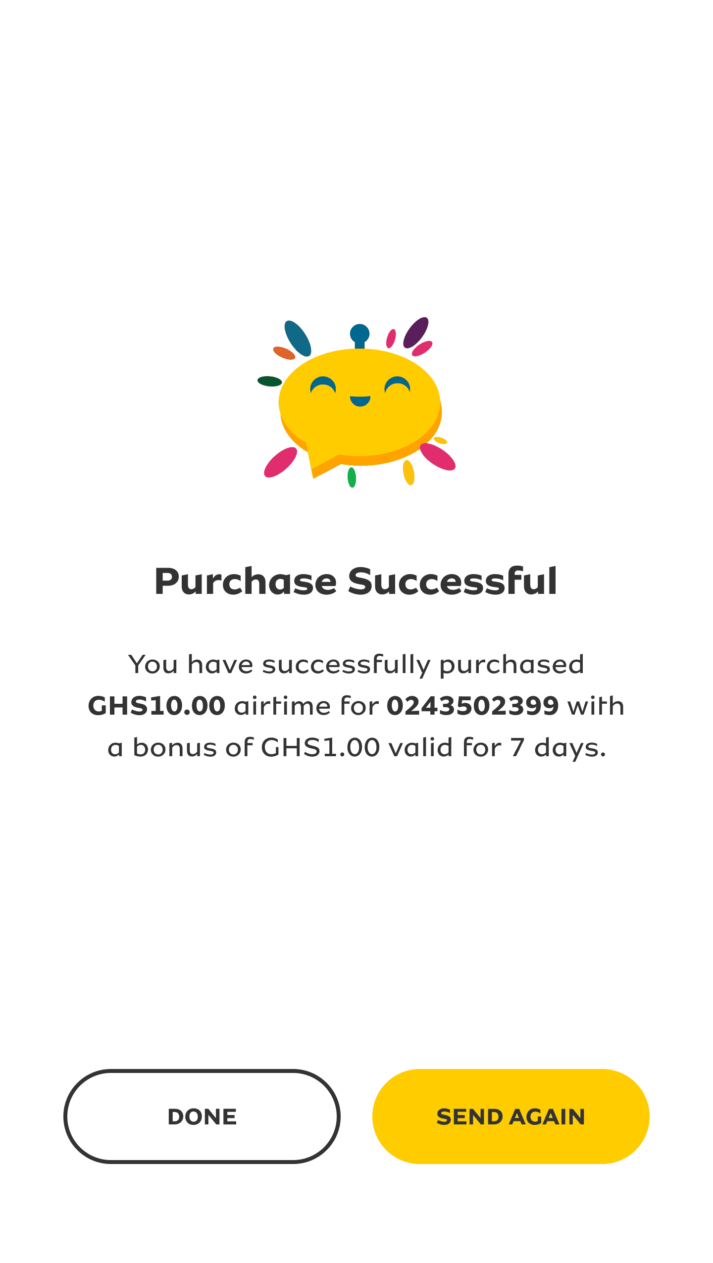
Success Page

The Process
How We Went About It
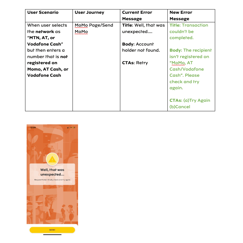
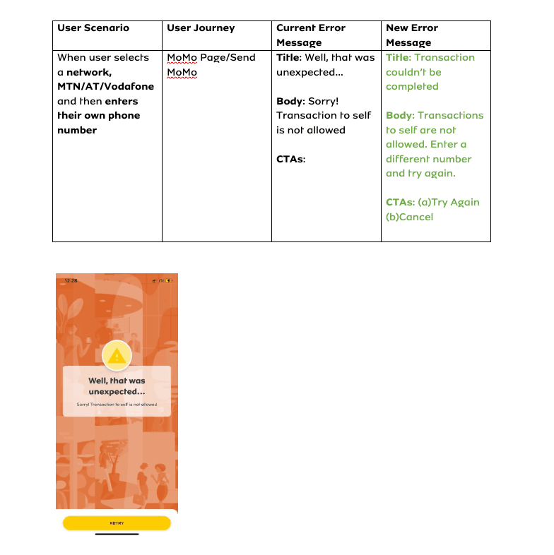
We compiled all error messages and crafted new ones following the #1 and #9 rules of the 10 Jakob Nielson’s UX heuristics.
We sifted through our App Store and Play store reviews to get a good understanding of what our users were saying about the prompt messages they’re receiving.
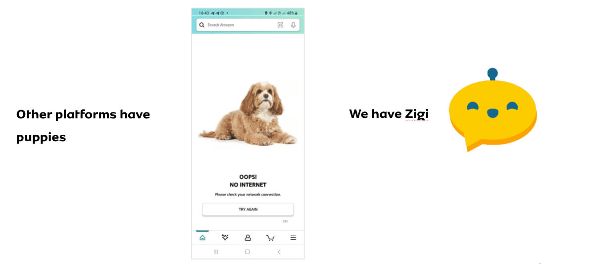
We then redesigned the error, success and pending pages, made them less cluttered, incorporated more white space and introduced the MTN chatbot mascot, Zigi, to give the pages a humane touch.
We re-looked at the CTAs on these pages and made them more persuasive, leading users to perform another transaction or to retry a failed transaction instead of just ending the flow.
Discovery
Compilation of Old Error Messages
User Reviews



The People I Worked With
I collaborated (and still am) with a number of stakeholders on this initiative:
Business Analysts - with their help, we compiled all the prompt messages that occur within the app and the instances that trigger them.
Product Owners - we worked with them to prioritise the changes we wanted to make.
Developers - we designed, they developed.