myMTN App — Zigi Chatbot Repositioning
Background
This is probably the simplest design decision I’ve ever made.
MTN Group has a chatbot assistant called Zigi. It’s found on a number of digital platforms, including the MTN website, Whatsapp, Facebook, the myMTN App, etc. Every month, the monthly active users (MAU) of the chatbot and the cost saved from users using the chatbot instead of other company resources like the call center or the walk-in services at the physical shops is measured and compared with the target set for those metrics for the year. Every channel that has Zigi is in a sense competing for the most cost savings and the highest number of active users.
The Problem
The Zigi numbers on the myMTN app were not the best. This was due to the placement of the chatbot on the app. It had low discoverability and as a result the MAU and the cost savings were low compared to the other channels.
Specific goals
- Increase user engagement
- Increase MAU
- Increase cost savings
Focus metrics
- MAU
- Cost savings
Solutions
Problem
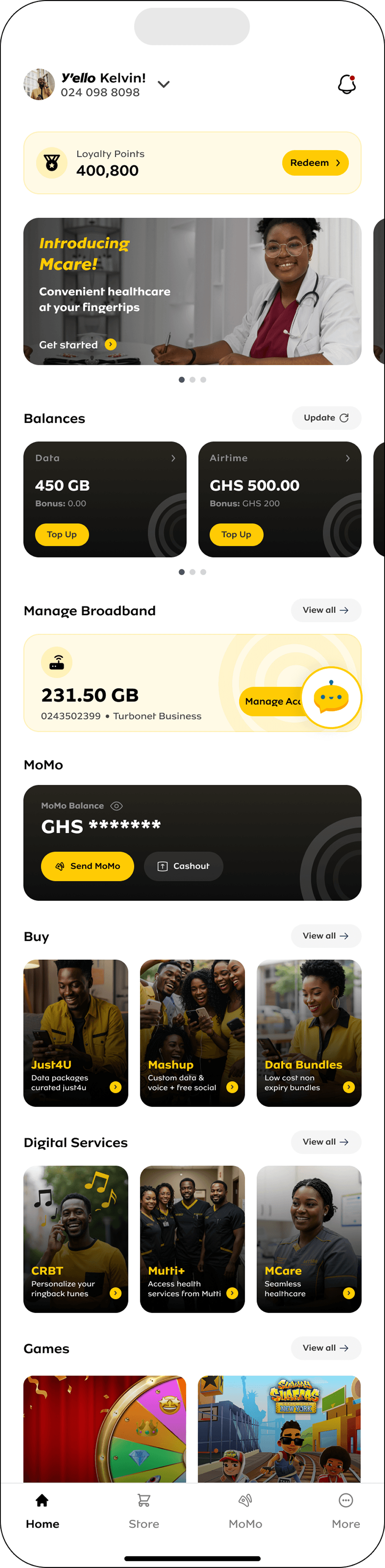
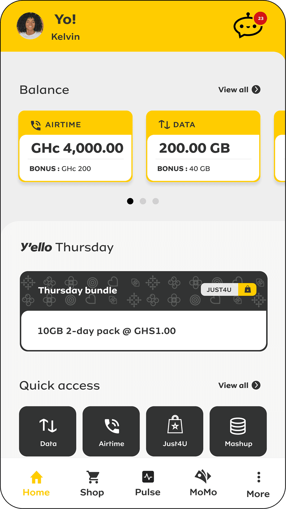
Users were having a hard time locating Zigi on the myMTN app. It was positioned in the top right corner, where the notifications icon is supposed to be.
Solution
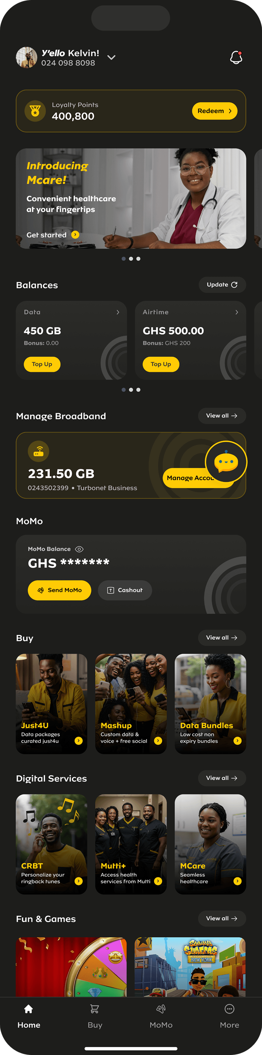
Repositioned the Zigi chatbot from the top right corner to the bottom right corner.
The flat Zigi icon was replaced with a 2 dimensional illustration of Zigi, in the form of a floating action button floating at the bottom right corner of the homepage of the app.
Design Principles
Mental Models
Users already expect a floating chat bubble in the bottom-right — where WhatsApp, Messenger, Intercom and countless sites put it. We matched that expectation instead of asking users to form a new one.
Nielsen Heuristic #4
Consistency and standards: follow platform and industry conventions. Placing chat support in the standard spot removes any doubt about what the icon does — no learning curve, no hesitation.
Jakob’s Law
“Users spend most of their time on other products. They prefer your site to work the same way.” Matching convention keeps that extra thinking off the user — so more of them actually try the chatbot.
The People I Worked With
I collaborated with a number of stakeholders on this initiative:
UX/UI Designers - as the team lead, I managed and steered my team to bring the solutions to life.
Product Owners - we worked with them to prioritise the changes we wanted to make.
Developers - we designed, they developed. There was pushback because the floating action button was a whole new component that we had not done before on the app. We were able to reach a consensus and the feature was built.
Data Analysts - we made the changes, they helped us track the impact.
Impact of this small but mighty design
2× chatbot MAU
Increase in the chatbot’s monthly active users (MAU) after the redesign, within the first 3 months of deployment. It increased from 150K MAU to 300K MAU.
1.7× cost savings
Increase in cost savings from $64K to $111K, driven by users reaching for the chatbot instead of traditional support channels.